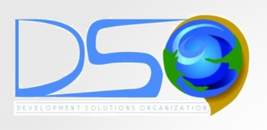
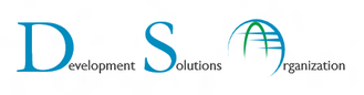
Here it is – the beginnings of the DSO brand
As part of DSO’s ongoing effort to evolve our online presence and presentation, the internal team decided it was time to update our logo.
Our original logo had served us well as we grew from inception into an organization that affected true change and positive impact. It conveyed a sense of the natural elements and international reach; as a non profit consultancy in international development, these characteristics served us well.
The design goals
As part of our evolution, we aimed to move toward a design that conveyed the following characteristics of our organization:
- Professional
- Trustworthy
- Proficient
- Friendly
- International
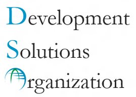
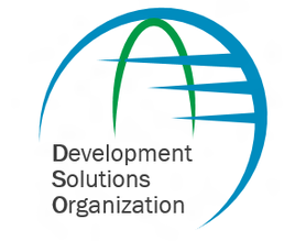
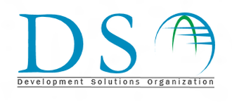
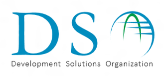
The options
With this aspiration, we brainstormed numerous concepts. We played with typography, size, color, and placement. Here were some of the front-runners:
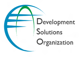
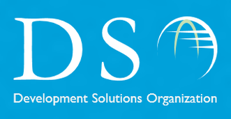
The winner
After much deliberation, finessing, and gathering of feedback, we held a team vote to pick one from the final concepts. The winner is the logo you see today, representing the DSO brand!


Thank you!
Contributed by Arwa Tyebkhan